SDSC 5002
EDA
Categorical Variable
The values of a categorical variable are labels of categories.
Categorical Variable -> Numerical Summary: by using the count or the percentage of individuals who fall in each category. 通过数量和百分比可以使得类变量拥有数值统计信息
Categorical Variable -> Graphical Summary:
- bar chart
- Pareto chart -> A sorted by frequency of bar chart
- pie chart less useful if we want to compare actual counts
Numerical (Quantitative) Variables
- The values of a numerical variable are numbers allowing arithmetic operations.
- Graphical Summary
- Histogram
- Divide the range of the possible values into equal intervals.
- histogram是紧接的,不要分开; barchart一般是分开的
- Histogram and density curve
- A density curve does not exactly mark the proportion of values in each range. -> smooth, continuous -> by kernel density estimation methods
- Histogram
- Numerical Summary
- Mean = average
- Median = 50th percentile
- Quartiles
- Q1 first quartile (25th percentile)
- Q3 third quartile (75th percentile)
- IQR is Q3 - Q1
- Variance and Standard Deviation (SD)
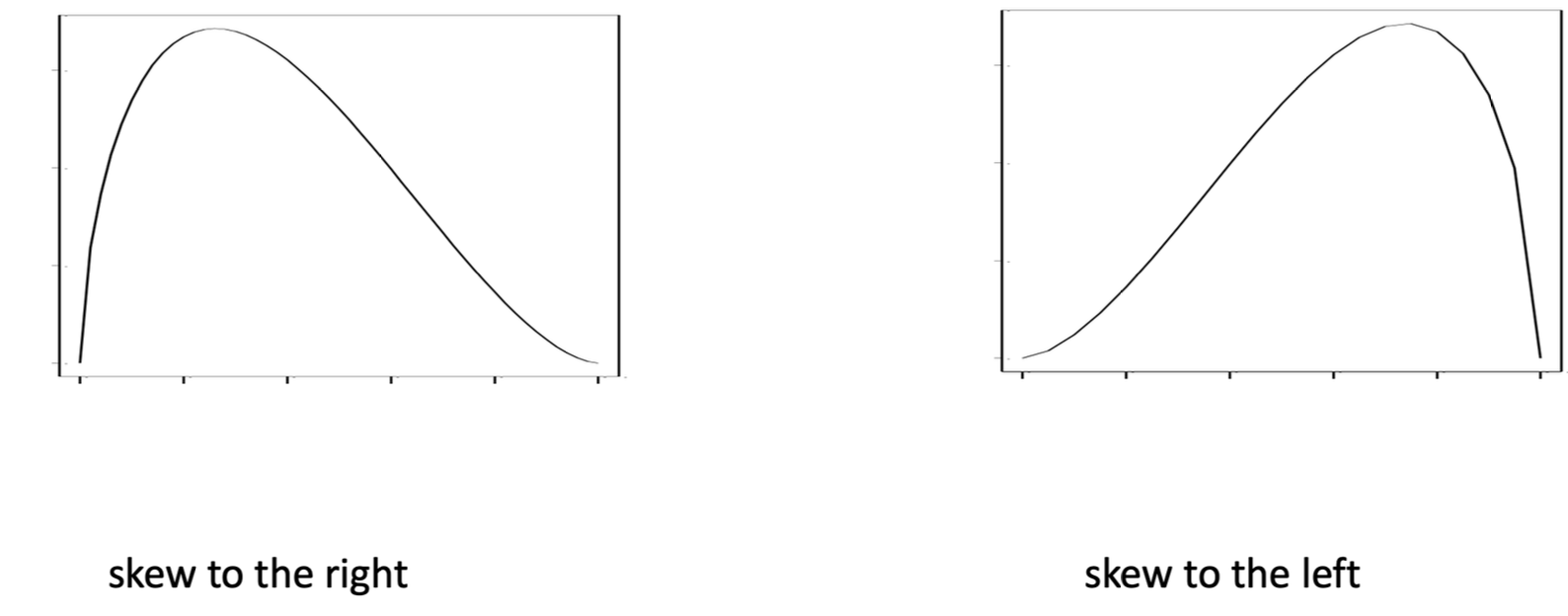
注意:仅使用箱线图或数值摘要(如均值、标准差)不足以完整描述分布的形状。尤其是对于具有复杂形状(如双峰分布)的数据,仅用这些统计量可能会掩盖一些重要特征。应结合直方图等图形方法来更好地展示数据的形状。
Caculate the quartiles
公式:
R: Percentile Rank 代表序号,用于表示取百分位数时的数据序号
P: Percentile 代表第P百分位数,经典值有25,50,75等
N: Number of Data 代表数据集里数字的个数
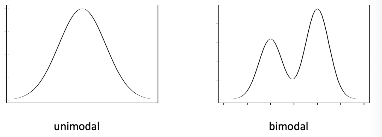
Shapes of a Distribution
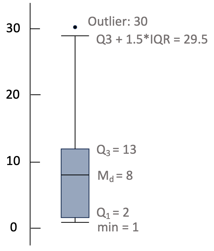
boxplot
Box
Lower : first quartile (Q1)
Middle: Median (Md)
Upper: third quartile (Q3)
Whisker
Lower: the larger value between
and minimum Upper: the smaller value between
and maximum
Relationship between two variables
Two categorical variables
- Contingency Table
- Joint distribution
- Distribution of a single variable in a two-way table = marginal distribution
Two numerical variables
- Scatterplot
- Correlation (r)
Simpson’s paradox
其中趋势出现在几组数据中,但当这些组被合并后趋势消失或反转。
一所美国高校的两个学院,分别是法学院和商学院。新学期招生,人们怀疑这两个学院有性别歧视。现作如下统计,列出Contingency Table
法学院
| 性别 | 录取 | 拒收 | 总数 | 录取比例 |
|---|---|---|---|---|
| 男生 | 8 | 45 | 53 | 15.1% |
| 女生 | 51 | 101 | 152 | 33.6% |
| 合计 | 59 | 146 | 205 |
商学院
| 性别 | 录取 | 拒收 | 总数 | 录取比例 |
|---|---|---|---|---|
| 男生 | 201 | 50 | 251 | 80.1% |
| 女生 | 92 | 9 | 101 | 91.1% |
| 合计 | 293 | 59 | 352 |
根据上面两个表格来看,女生在两个学院都被优先录取,即女生的录取比率较高。现在将两学院的数据汇总:
| 性别 | 录取 | 拒收 | 总数 | 录取比例 |
|---|---|---|---|---|
| 男生 | 209 | 95 | 304 | 68.8% |
| 女生 | 143 | 110 | 253 | 56.5% |
| 合计 | 352 | 205 | 557 |
在总评中,女生的录取比率反而比男生低。
这个例子说明,简单的将分组数据相加汇总,是不能反映真实情况的。
Correlation (
Measures the direction and strength of the linear relationship between two numerical variables
- between –1 and 1
- Extremes$ r = -1$ and
occur if and only if the points on a scatterplot lie exactly along a straight line
- Extremes$ r = -1$ and
- the symbol of
denote direction - the
denote relation strength |r| 越大代表点和线越紧密,反之越稀疏 measures the strength of only the linear relationship, it does not describe curved relationships or Slope斜率 has no units of measurement
Random Variables
The Sharpe Ratio
and are the mean and SD of the return on the investment stands for the return on a risk-free investment 无风险利率
Visualization and Data processing
Data Preprocessing
Major Tasks:
Data cleaning
- Fill in missing values, smooth noisy data, identify or remove outliers, and resolve inconsistencies
- Example: filling in missing values in blood test
Data integration
- Integration of multiple databases, data cubes, or files
- Example: integrating electronic health record with nursing home data
Data transformation
- Normalization and aggregation
- Example: age, weight, height, income
Data reduction
- Obtains reduced representation in volume but produces the same or similar analytical results
- Example: under-sample in tumor detection; embedding method in deep learning
Data discretization 离散化
- Part of
data reductionbut with particular importance - Example: young, middle-age, elderly
- Part of
Handle missing data
- Ignore the tuple
- Fill in the value
- manually
- constant
- mean
- most probable value
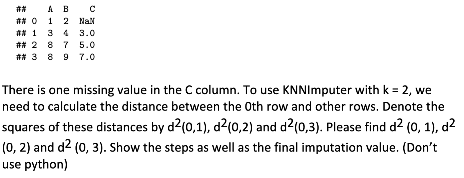
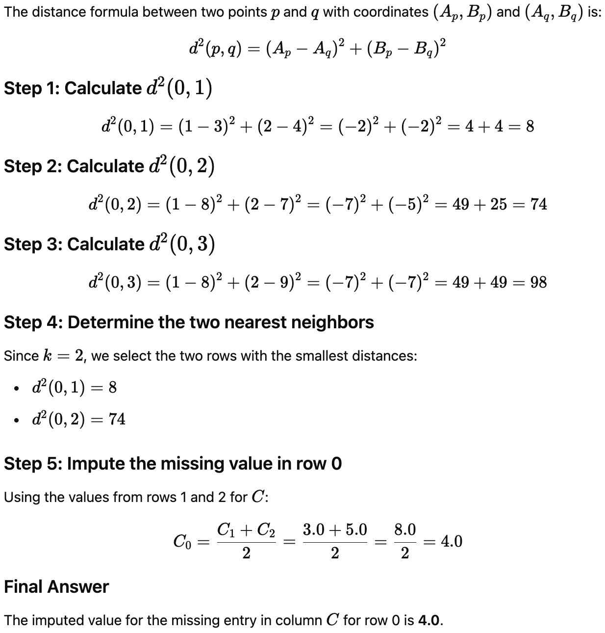
Imputing missing data by k-Nearest Neighbors
使用非缺失列算出距离,选定K个最近的点,这些点对应的缺失列平均值即为插值
Quiz4-KNNImputer 插值法
Handle noisy data
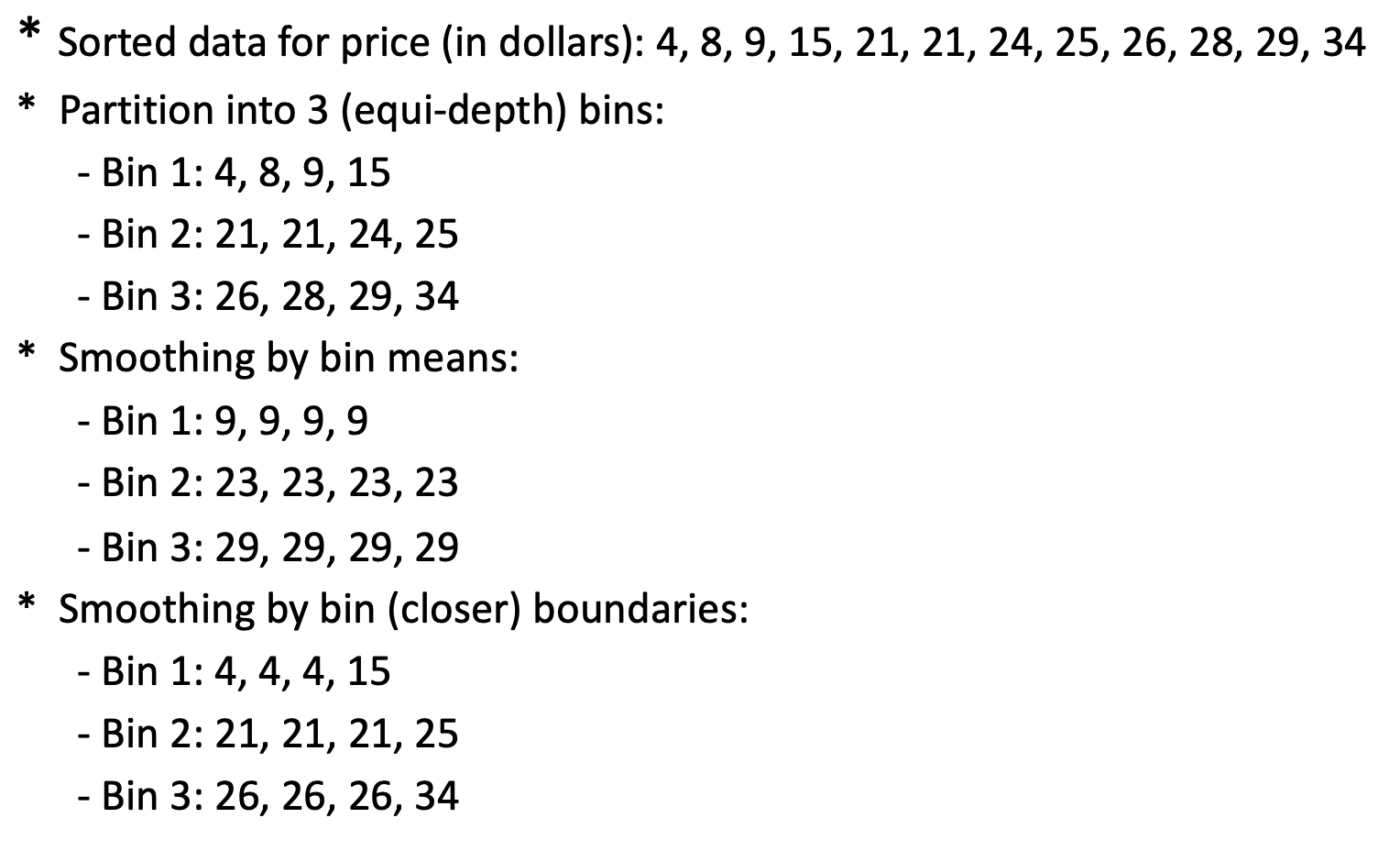
- Binning method
- first sort data and partition into (equal-depth) bins
- then smooth by bin means, smooth by bin median, smooth by bin boundaries, etc.
- Clustering
- detect and remove outliers
- detect suspicious values 异常值 and check by human
- Regression
- smooth by fitting the data into regression functions
Data binning
Data transformation
Normalization
Min-max normalization
Z-score normalization
Normalization by decimal scaling
Log transformation normalization
Discretization
Discretization is the process of transferring continuous functions, models, variables, and equations into discrete counterparts.
离散化是将连续函数、模型、变量和方程转换为离散对应物的过程。
Methods
- Binning
- Histogram analysis
- Clustering analysis
Supervised learning
Linear regression model
The simplest of all is a (simple) linear regression model; that is, the response or target
in which
is the intercept term is the slope and are coefficients or parameters of the linear model is a noise term, which is assumed to have mean zero - It is often assumed to be normally distributed in theoretical analysis.
- Often, we assume the standard deviation of
, denoted by , is unknown. is another parameter of the simple linear regression model.
Decomposition of the Equation
: Represents the average child height. : Represents the "regression to the mean" effect, which shows the adjustment for parents who are taller or shorter than average
Fitting the regression model
Performance
Residual sum of squares(RSS)
Total sum of squares(TSS)
Residual standard error (RSE)
where ( p = ) # of features ( ( p = 1 ) in simple linear regression).
is close to 1 indicates that a large proportion of the variability in the response is explained by the regression. is close to 0 indicates that the regression does not explain much of the variability in the response (this might occur because the linear model is wrong, or the error variance is high, or both. )
当评估使用训练数据(即样本内
)且方法为最小二乘法时,R2 在 0 到 1 之间
Quiz
Given the regression equation
How is change in
Calculation:
If
Approximating,
Using By Python
There are five basic steps when you are implementing linear regression:
Import the packages and classes you need.
Provide data to work with and do appropriate transformations if necessary.
Create a regression model and fit it with existing data. Check the results of model fitting to know whether the model is satisfactory.
Apply the model for predictions.
Logistic regression
Sigmoid for Logistic regression model
example
Suppose we collect data for a group of students in a statistics class with variables
- Question 1: Estimate the probability that a student who studies for 40 hours and has an undergrad GPA of 3.5 will get an A in the class.
要估计一个学生在学习40小时且GPA为3.5时获得A的概率(即
- Question 2: How many hours would the student in the previous part need to study to have a 50% chance of getting an A in the class?
要求学生有50%的概率获得A,即
Linear discriminant analysis
Linear Discriminant Analysis (LDA) is a classification method that assumes the feature distribution for each class follows a Gaussian (normal) distribution with different means but the same covariance matrix.
LDA 决策边界的计算方法是,假设两个类别的方差相同,仅均值不同,从而最大化类别之间的分离。
Bayes’ Theorem
by using LDA,
其中
Confusion matrix
his image represents a confusion matrix with the following labels:
| Actual \ Predicted | ||
|---|---|---|
| True Positive (TP) | False Negative (FN) | |
| False Positive (FP) | True Negative (TN) |
Type I error:
Type II error:
Specificity:= 1- type I error rate
- Power (a.k.a. sensitivity; a.k.a. recall) = 1-type II error rate
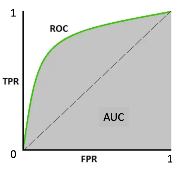
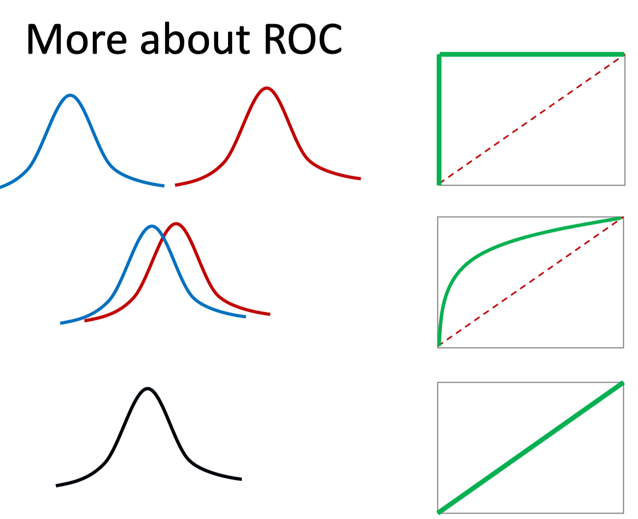
ROC
Receiver Operating Characteristic is a graphical plot used to evaluate the performance of a binary classifier.
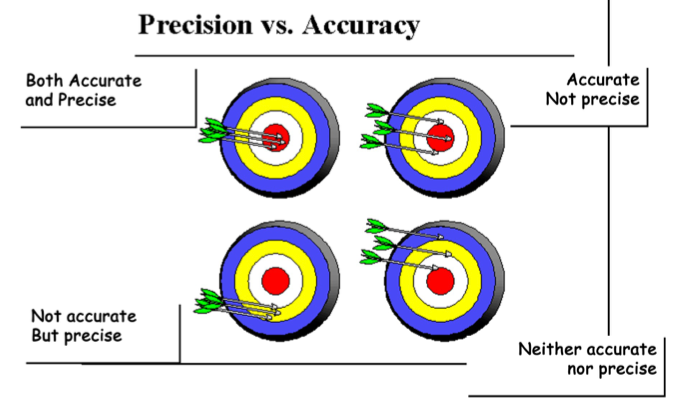
Accuracy vs Precision
- Accuracy refers to the closeness of a measured value to a standard or known value.
- Precision refers to the closeness of two or more measurements to each other.
example
Based on the following confusion matrix, compute specificity, sensitivity, and precision.
| Y=1 | Y=0 | |
|---|---|---|
| Ŷ=1 | 20 | 10 |
| Ŷ=0 | 4 | 25 |
True Positives (TP): 20
False Positives (FP): 10
False Negatives (FN): 4
True Negatives (TN): 25
1. Sensitivity (True Positive Rate)
2. Specificity (True Negative Rate)
3. Precision
Functions in Python
DataFrame.infohttps://pandas.pydata.org/docs/reference/api/pandas.DataFrame.info.html#pandas.DataFrame.infoDataFrame.columnsThe column labels of the DataFrame.
DataFrame.indexhttps://pandas.pydata.org/docs/reference/api/pandas.DataFrame.index.html#pandas.DataFrame.index The index (row labels) of the DataFrame.
DataFrame.dtypeshttps://pandas.pydata.org/docs/reference/api/pandas.DataFrame.dtypes.html#pandas-dataframe-dtypespandas.isnahttps://pandas.pydata.org/docs/reference/api/pandas.isna.html#pandas-isna
处理missing data
DataFrame.dropnahttps://pandas.pydata.org/docs/reference/api/pandas.DataFrame.dropna.html#pandas-dataframe-dropnaaxis: {0 or ‘index’, 1 or ‘columns’}, default 0 Determine if rows or columns which contain missing values are removed.
0, or ‘index’ : Drop rows which contain missing values.
1, or ‘columns’ : Drop columns which contain missing value.
Only a single axis is allowed.
how: {‘any’, ‘all’}, default ‘any’ Determine if row or column is removed from DataFrame, when we have at least one NA or all NA.
‘any’ : If any NA values are present, drop that row or column.
‘all’ : If all values are NA, drop that row or column.
DataFrame.fillnahttps://pandas.pydata.org/docs/reference/api/pandas.DataFrame.fillna.html#pandas-dataframe-fillna
计算百分位的方法
Series.quantilehttps://pandas.pydata.org/docs/reference/api/pandas.Series.quantile.html#pandas-series-quantile- q: float or array-like, default 0.5 (50% quantile) The quantile(s) to compute, which can lie in range: 0 <= q <= 1.
DataFrame.quantilehttps://pandas.pydata.org/docs/reference/api/pandas.DataFrame.quantile.html#pandas-dataframe-quantile
计算相关性的方法
首先需要筛选出可以计算相关性值
DataFrame.select_dtypes(include=None, exclude=None)https://pandas.pydata.org/docs/reference/api/pandas.DataFrame.select_dtypes.html#pandas.DataFrame.select_dtypesDataFrame.corrhttps://pandas.pydata.org/docs/reference/api/pandas.DataFrame.corr.html#pandas.DataFrame.corrseaborn.heatmaphttps://seaborn.pydata.org/generated/seaborn.heatmap.html#seaborn-heatmap- data: rectangular dataset 2D dataset that can be coerced into an ndarray. If a Pandas DataFrame is provided, the index/column information will be used to label the columns and rows.
- vmin, vmax: floats, optional Values to anchor the colormap, otherwise they are inferred from the data and other keyword arguments.
- annot: bool or rectangular dataset, optional If True, write the data value in each cell. If an array-like with the same shape as data, then use this to annotate the heatmap instead of the data. Note that DataFrames will match on position, not index.
corr = df.select_dtypes('number').corr()

import seaborn as sns
sns.heatmap(corr, cmap="Blues", annot=True)
画density curve
seaborn.histplothttps://seaborn.pydata.org/generated/seaborn.histplot.html#seaborn-histplot 如果我们需要画hist加上density curve,使用这个函数并加入kde=True- data:
pandas.DataFrame,numpy.ndarray, mapping, or sequence - bins: str, number, vector, or a pair of such values Generic bin parameter that can be the name of a reference rule, the number of bins, or the breaks of the bins.
- data:
sns.histplot(df['medv'], kde=True,bins=10)seaborn.kdeplothttps://seaborn.pydata.org/generated/seaborn.kdeplot.html#seaborn-kdeplot 如果我们需要单独画density curve,使用这个函数
sns.kdeplot(df['medv'])seaborn.displothttps://seaborn.pydata.org/generated/seaborn.displot.html#seaborn-displot 这是个通用的入口,可以指定图表类型,同时接受该图表对应的参数- data:
pandas.DataFrame,numpy.ndarray, mapping, or sequence - kind{“hist”, “kde”, “ecdf”} Approach for visualizing the data. Selects the underlying plotting function and determines the additional set of valid parameters.
- data: